Modern engineering techniques have given architects the freedom to go absolutely nuts as they run around cities and towns experimenting with all manner of crazy new structures. Like any artists given access to a wholly new set of artistic tools, the line between aesthetic choice and horrible mishap can prove somewhat fuzzy at first glance. Here we present some truly amazing buildings from around the world that — at first impression — appear to have either 1) suffered a big “uh-oh don’t tell the foreman” moment in the construction process, or 2) come into contact with a devastating natural calamity. These are the amazing architectural mistakes that weren’t.
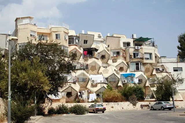
1. Ramot Polin Apartments (Jerusalem, Israel)
Table of Contents
While this chaotic collage of shapes and structures looks like the aftermath of a horrible desert landslide, this mishmash of engineering is actually a three-decade-old Israeli housing project near Jerusalem. This settlement structure in Ramot Polin was commissioned by the Israeli Ministry of Housing to settle wider parts of greater Jerusalem after the Six-Day War of ’67. In order to quickly build in open land, engineers experimented with various designs such as Ramot Polin’s use of prefabricated components built around the natural landscape.
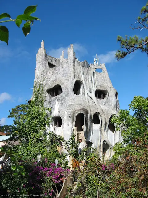
2. Hang Nga guesthouse (Dalat, Vietnam)
I imagine this is similar to what a medieval castle would look like if it melted. While this “fairy tale house” is meant to invoke elements of the natural world, this passion project of Vietnamese architect Dang Viet Nga featuring smooth irregular surfaces seems a more fitting ode to the Nazi face-melt guy from Indiana Jones. Rather than going by a conventional architectural blueprint model of construction, Nga hired local, “non-professional” workers to bring his handmade paintings into reality. This strange organic huzzabaluzza was originally intended as Nga’s personal home, but upon facing financial struggles stemming from the project, the structure was expanded in 1990 to include a guest house for rent.
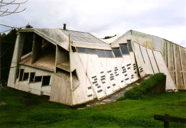
3. Errante Guest House (Ciudad Abierta, Chile)
This building looks like either what would happen if you 1) used a four-year-old’s crayon rendering of a house as your blueprint or 2) chucked a perfectly good shotgun house off a cliff. But what we are actually looking at is an experimental building that existed in the late 1990s as part of the Catholic University of Valparaiso in Chile. The peculiar angles of the building were meant to deflect the wind shears to be utilized in temperature control.
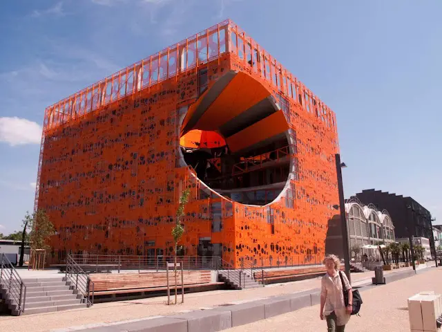
4. Le Cube Orange (Lyon, France)
In Lyon, France you will find a building that stands as a testament to the very real danger of having a run-in with a trendy asteroid. This six-story showroom sports a gigantic gaping hole in its orange façade. However, this orange impact crater has some very green applications such as allowing natural light flow into the building and facilitating a natural flow of air throughout the structure.
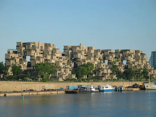
5. Habitat 67 (Quebec, Canada)
The Habitat 67 housing complex on the Saint Lawrence River in Quebec resembles a modular skyscraper made of giant Jenga pieces that toppled over. The complex was a product of architect Moshe Safdie for the Expo 67 world’s fair in Canada, but the multiple platforms seems like it was specifically designed for that distinctively new millennium sport of free running.
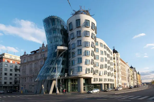
6. Dancing House (Prague, Czech Republic)
Oh no, some jerk Czech giant squished a whole commercial center together, melting that middle structure into a molten blob of building goo! When paying a visit to the real-life fairytale (visually speaking) known as Prague, you can take in a bit of post-modernism via the Frank Gehry co-designed “Dancing House.” While “dancing” seems to invoke elegance, I can’t help but think of that futurescape in Idiocracy. Not to say this building doesn’t have some lively visible wit. It does! But, at first glance, it does kind of look like a mess someone didn’t fix very well.
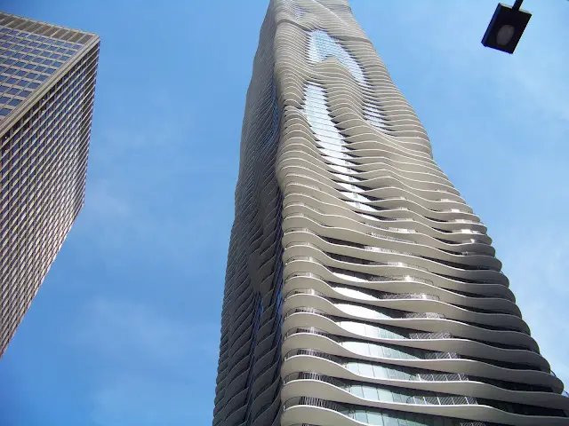
7. Aqua Skyscraper (Chicago, U.S.A.)
Chicago’s Aqua Skyscraper has a melty, swervy design that seems like it’s doing its best to approximate what a traditional skyscraper would look like after a few minutes in the microwave. But the smooth curves and contours of this residential/commercial complex are meant to approximate the flow of water (thus the name). It’s a beautiful structure, but it does give the impression of being semi-digested.
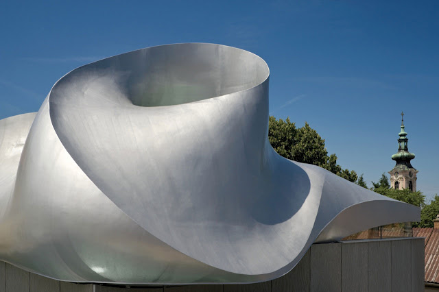
8. Martin Luther Church (Hainburg, Austria)
What looks like an extreme case of moisture-warping is actually a deliberate artistic decision meant to celebrate the life of Martin Luther. And what better way to celebrate the life of the father of the Protestant Reformation than with a church topped with what appears to be a multi-dimensional Calabi-Yau manifold? I can’t think of any. Neither could the firm behind this newly-completed 50-person church in Hainburg, Austria.
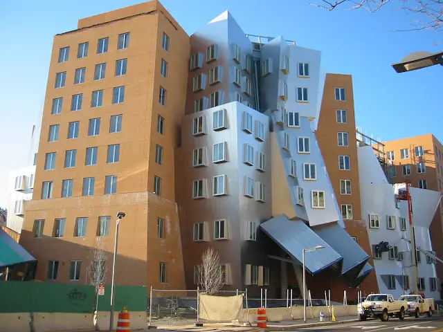
9. Ray and Maria Stata Center (Cambridge, Massachusetts)
Behold the effects of tectonics crinkling a perfectly good building into a chaotic, multi-planed hodgepodge. Or that’s just what the future looks like: if not attractive, at least interesting. When the Massachusetts Institute of Technology (MIT) was looking for a new academic center to house some of its cutting-edge research, they turned to bizarre visionary Frank Gehry (who you may recognize from Prague’s “Dancing House”). The ambitious project resulted in a lawsuit against Gehry because of numerous construction problems including cracking components, drainage back-up, and the unaccounted-for effect of ice in the New England winter. This isn’t the first time Gehry has not anticipated problems in his forward-looking projects.
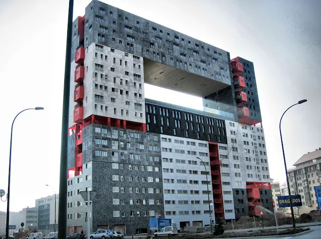
10. Edificio Mirador (Madrid, Spain)
The architecture team behind this building is going to be so embarrassed when they realize they forgot to design the center of it! Well, at least the inhabitants of this 21-story residential building are left with a large, communal lookout area. When life gives you lemons, we suppose. As another interesting side note, each different-colored section is its own architectural plan holding its own type of apartment unit. The whole building is like its own multi-faceted vertical city.
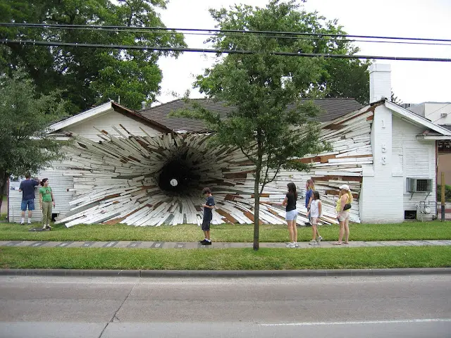
Honorable Mention: The Hole House (Houston, Texas)
The Hole or “Tunnel” house was never meant to be lived in — in its holey form, anyway. It was a house slated for demolition near Houston, Texas. Two local artists Dan Havel and Dean Ruck decided to turn it into a grandiose public art installation that laughs in the face of the local housing code. Unfortunately, for those who were looking to use The Hole House as a backdrop for a great Facebook photo, it was finally demolished in 2005. Alas.
